Linkedin: Can we improve the user experience for Linkedin's notification?
- Jul 4, 2021
- 1 min read
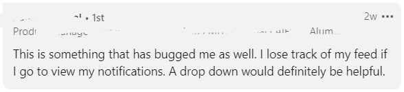
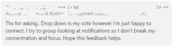
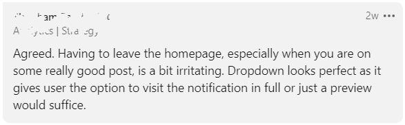
The notification problem on Linkedin is a big one (proof below). I wanted a way to view my notifications without leaving the homepage on Linkedin.

Linkedin notifications can be a nuisance and a distraction. I always wondered why didn't they use a dropdown menu for the notifications? So, I posted about the issue on Linkedin, asking users what they thought about this? I made a rough prototype in photoshop to get feedback.

Feedback:
After knowing the impact, we developed a chrome extension that adds a new notification button that opens a pop window for notification.

This new pop-up notification window will allow the user to save time and improve their experience.
Give it a try and let me know what you think. I didn't set up a developer's account yet, so please use the download link and load the package.
Download extension: https://drive.google.com/file/d/1REcW95q6O9ayYPfKJsJvtqUlkzhhqB71/view?usp=sharing
(Steps to load the extension: https://webkul.com/blog/how-to-install-the-unpacked-extension-in-chrome/)

We tried to make it a dropdown menu at first (like the prototype above), didn't pan out as planned. So we settled for a pop-up window.
There might be some errors unaccounted for and, so if you find any errors, do let me know.


Comments